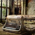
I have been asked by a couple contacts on Flickr about the making of this image, so once again here is a break-down of the different components used, and stage I went through to reach the finished article.
The first stage was to combine a lighter exposure with a darker exposure, so I pasted the lighter layer (which had already had a tone curve applied to increase the contrast slightly) on top of the darker one, then hid this with a layer mask so it looked like this:

I then used a soft fat brush to reveal selective lighter elements hidden beneath:

I added a brightness/contrast adjustment layer to darken parts of the image further, and erased this where I didn’t want it to show. After this, I added a texture layer similar to the one below (can’t recall exactly which one, I have so many!) which was shot in one of the asylums I visited, and blended this using “overlay” mode. I erased most of this so that the texture only showed on the typewriter and a little on the background:

and the result was this:

After this I added a scan of an old phone bill that my great grandmother had squirrelled away, and deleted the white background around it so that this part became transparent:

I blended this using “multiply” and moved it around until the letters and numbers where positioned where I wanted them, and partially erased some of the straight lines over the typewriter:

Finally I added this texture from Jerry Jones and blended it using “soft light”, and erased parts of it where it was too dark:

The finished result was “Communication”. See Flickr for more from Jerry Jones (Skeletalmess)


Viveca, interesting to see your technique here. Thanks for sharing. Great image.
Louis