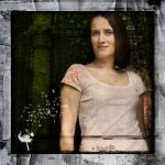
 Having spent all afternoon on this image, I have decided once more to share how I did it, and which individual images went into making the final artwork. I started with a self-portrait taken recently in the New Forest, using flash diffused through an umbrella, one of the first that I have ever done using this tecnhnique (and thanks again to Mark Blundell for loaning me his umbrella and passing on his expertise!), and cropped this square which is my preferred format.

After adding a tone curve to slightly boost the contrast, I then proceeded to play around with various borders from my library, some of which are my own designs, many are from the talented and generous artists Jerry Jones and Dubtastic, both of whom share their designs for free download. This part of the process is very much trial and error – what looks great as a standalone frame can look totally different when layered on top of a photograph and sometimes simply does not work with that image. After trying two, I finally settled on this one by Jerry Jones:

The next texture I added was one of my favourites, of badly cracked wall paper that I shot in an abandoned building. I have used this one a few times on previous images and love the solid, “broken” look that it gives. Originally the largest crack at the bottom right was right over the top of my stomach in the original portrait image, and I left it there for a long time as I worked, but in the end I erased much of this layer as it was giving the wrong feel to the image, making it look too decayed and a bit grim, which was not my aim here. Eventually I just left some of the cracks around the edge of the frame. I then added the dandelion using a brush downloaded from Obsidian Dawn, also the individual seeds floating away using two separate brushes from the same source.

I still felt that the image was lacking something, and not quite working with the cracked paper texture, so reviewed my texture library once more. The final texture to be added was a rather uninspired photo of a wrought iron gate which I took during my recent trip to Venice. I thought it was so dull I didn’t even include it on my diary blog, but could still see the texture potential that it had. Up until this point I had blended the previous layers together using “multiply” mode in Photoshop, but for this one I used the blending mode “Colour Burn” which added vibrance to the texture.

After combining all these layers, I created an adjustment layer for hue/saturation and also for brightness/contrast, as the image had become rather dark with all the many layers used. Throughout this process I am erasing various parts of the layers to blend everything seamlessly together, which is where I feel the real art comes into it, and why it took me all afternoon!
Please see the set “Textures and Fine Art” on my Flickr stream if you liked this image.


You are the queen of textures! I’m going to start collecting my own… you’ve inspired me. And thank you for the link for the brushes. I will have to take a look at those. Great tutorial!
great post, thanks for sharing