
I hate it when this happens – I cannot decide between these two slightly differently processed photographs which one I prefer or which one is better – the darker and more moody version with the emphasis on the painting, or the brighter one that shows up more of those tasty textures? I would welcome any thoughts and feedback from my viewers!
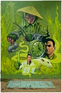
This is a piece by Faunagraphic, a female eco-graffiti artist who has created some exquisite work with an emphasis on nature and the female form. This one was sadly past its prime as the plaster had begun to crumble away, but I hope that I will get further opportunities to see more of her work over time. Shot in an abandoned building in Sheffield, South Yorkshire.

i prefer the dark one because the brighter side is taken care of by the graffiti so the contrast is perfect. I love how you create the thought process to go with your image/s! Awesome work Viveca. x
While I like the details of the lighter one, I definitely love the highlight only being on the face in the darker one. Great works either way! 🙂
I like the first one where the room is dark and the emphasis is on the art work. Great shot and the moodiness of it fits the place where this was shot!
Oh, this is a difficult one. I like both for the same reasons that Toad Hollow does, but I prefer the first one for its moody atmosphere. However I do think that it may be a bit too dark; perhaps something mid way between the two, still keeping emphasis on the graffiti but allowing more of the texture of the lighter image to break through?
Really tough one, especially as I like both images for different reasons.
Hmm. I would say the second one, as the information in the shot is really interesting, and I think it adds to the graffiti image. The first image concentrates in on the graffiti too much, losing all the wonderful context of the setting.
Just my preference though.
I didn’t study for this test!! Wow, Viveca, how are supposed to choose? Really impossible. In the first one, I do love the moody tones and the way both that fantastic art and the window in the upper right area of the frame are the prime bits, but the second one really shows off the entire scene in textury-goodness! I guess if I *had* to choose here, I’d go for the second one, and that’s only a personal preference because I love textures you can almost feel in photography. Great post today!
It looks as if opinion might be divided here ….. I guess a lot of it is just down to personal taste? I like both versions for different reasons, but the dark one is the original and the version I intended to post before I started tinkering with it. Time to sleep on it I think!
In my opinion the darker shot works far better, my thinking is that the framing with the graff in the foreground gives it priority over the environment, the focus on it in the darker shot works a treat, you’re still getting the tasty textures on the wall the graff is on, the lighter shot seems a little flat in comparison, the shadows and light in the darker shot create a far more interesting atmosphere, just my 2 bobs worth seeing as you asked 😉
Thanks Shando, that’s *really* helpful!